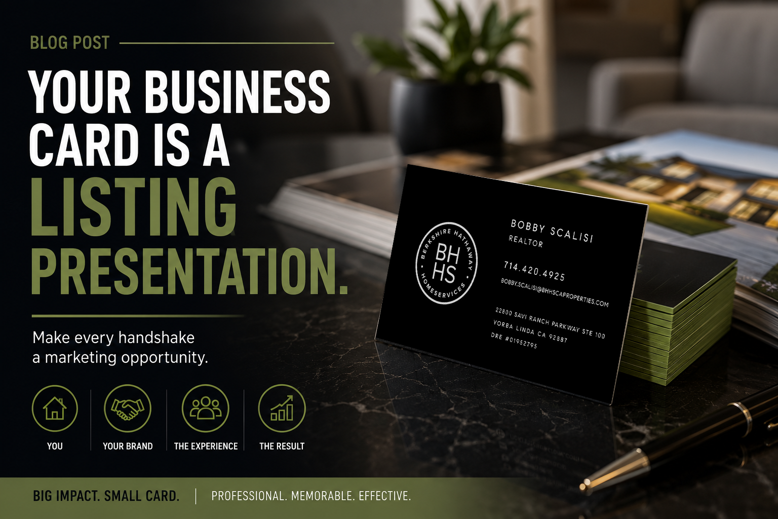
A business card is the only piece of marketing a seller holds in their hand while they decide whether to trust you. It takes about four seconds to make its argument. Here is what actually moves that argument in your favor.
Weight is the first signal
Before anyone reads a word, they feel the card. A 14pt stock card reads as disposable. A 32pt card with a soft-touch laminate reads as expensive — and by extension, so do you. It is the single cheapest upgrade in your entire marketing budget.
Say one thing
The most common mistake we fix is cards trying to carry a resume. Nine designations, four phone numbers, three social handles, a QR code, and a slogan. Pick the one thing you want remembered: your name, or your team, or your neighborhood. Everything else supports it.
Photo, or no photo
A headshot works when it is a real, current, professionally lit photo. It works against you when it is a cropped phone picture from four years ago. If you do not have a good one, run the card without it — a clean typographic card outperforms a bad photo card every time.
Details sellers notice without knowing it
- Consistent alignment. Ragged margins read as careless.
- Real contrast. If your phone number is light grey on white, it will not get dialed.
- Legible type at actual size. What looks elegant on a screen can be unreadable in a wallet.
- A finished back. Blank backs waste half your real estate; a subtle logo, a QR to your listing site, or a short value line all earn their space.
Print it in quantity
Cards get cheaper fast at volume — our range runs $85 for 500 standard up to about $410 for 5,000 premium XL. Agents who run out of cards stop handing them out, which defeats the purpose. Order more than you think you need.
The takeaway
You are not designing a contact card. You are designing the physical object that sits on a seller's kitchen counter next to two competitors' cards. Make yours the one that feels like the professional choice.